Edit chart
Loading graph
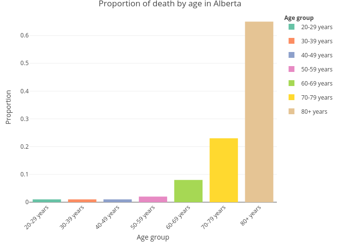
Ykhademc's interactive graph and data of "Proportion of death by age in Alberta" is a grouped bar chart, showing 20-29 years, 30-39 years, 40-49 years, 50-59 years, 60-69 years, 70-79 years, 80+ years; with Age group in the x-axis and Proportion in the y-axis.. The x-axis shows values from 0 to 0. The y-axis shows values from 0 to 0.