Edit chart
Loading graph
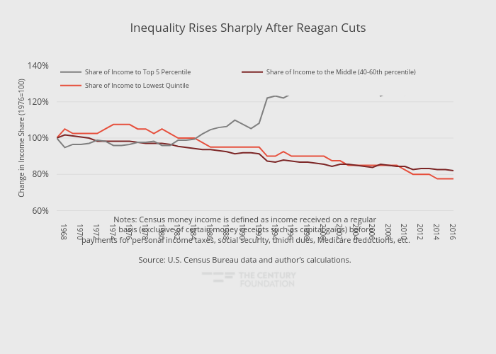
Thecenturyfoundation's interactive graph and data of "Inequality Rises Sharply After Reagan Cuts" is a line chart, showing Share of Income to Lowest Quintile, Share of Income to the Middle (40-60th percentile), Share of Income to Top 5 Percentile; with in the x-axis and Change in Income Share (1976=100) in the y-axis.. The x-axis shows values from 1967 to 2016. The y-axis shows values from 59 to 141. This visualization has the following annotation: Notes: Census money income is defined as income received on a regular <br> basis (exclusive of certain money receipts such as capital gains) before <br>payments for personal income taxes, social security, union dues, Medicare deductions, etc.Source: U.S. Census Bureau data and author’s calculations.