Edit chart
Loading graph
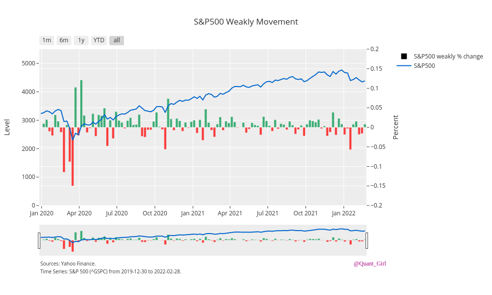
Quantgirluk's interactive graph and data of "S&P500 Weakly Movement" is a bar chart, showing S&P500 weakly % change vs S&P500; with Percent in the y-axis. The x-axis shows values from 0 to 0. The y-axis shows values from -0.2 to 0.2. This visualization has the following annotations: Sources: Yahoo Finance.; Time Series: S&P 500 (^GSPC) from 2019-12-30 to 2022-02-28.; @Quant_Girl