Edit chart
Loading graph
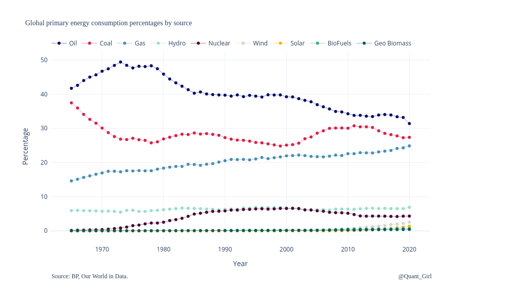
Quantgirluk's interactive graph and data of "Global primary energy consumption percentages by source" is a , showing Oil, Coal, Gas, Hydro, Nuclear, Wind, Solar, BioFuels, Geo Biomass; with Year in the x-axis and Percentage in the y-axis.. The x-axis shows values from 0 to 0. The y-axis shows values from 0 to 0. This visualization has the following annotations: Source: BP, Our World in Data.; @Quant_Girl