Edit chart
Loading graph
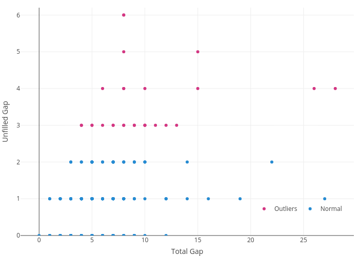
Pltlzs's interactive graph and data of "Unfilled Gap vs Total Gap" is a scatter chart, showing Outliers vs Normal; with Total Gap in the x-axis and Unfilled Gap in the y-axis.. The x-axis shows values from 0 to 0. The y-axis shows values from 0 to 7.2.