Edit chart
Loading graph
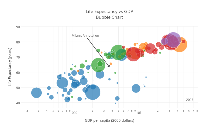
Milan's interactive graph and data of "Life Expectancy vs GDPBubble Chart" is a scatter chart, showing Africa, Americas, Asia, Europe, Oceania; with GDP per capita (2000 dollars) in the x-axis and Life Expectancy (years) in the y-axis.. The x-axis shows values from 2.2040916625048776 to 4.918379238719186. The y-axis shows values from 36.324623672665126 to 90.34700250569831. This visualization has the following annotations: 2007; Milan's Annotation