Edit chart
Loading graph
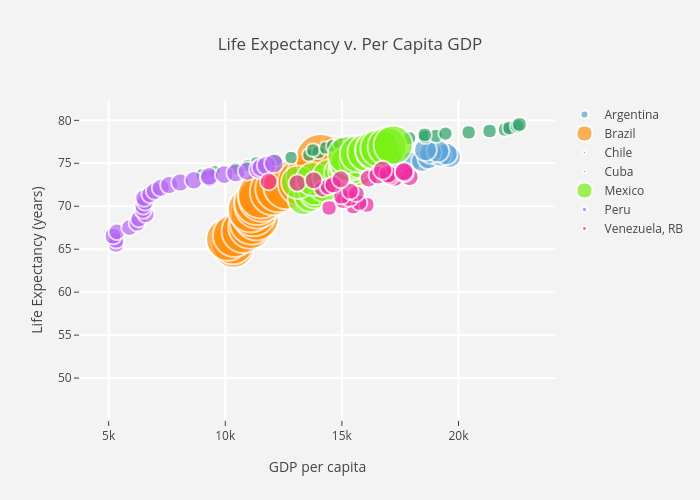
Mikecz's interactive graph and data of "Life Expectancy v. Per Capita GDP" is a scatter chart, showing Argentina, Brazil, Chile, Cuba, Mexico, Peru, Venezuela, RB; with GDP per capita in the x-axis and Life Expectancy (years) in the y-axis.. The x-axis shows values from 0 to 0. The y-axis shows values from 0 to 0.