Edit chart
Loading graph
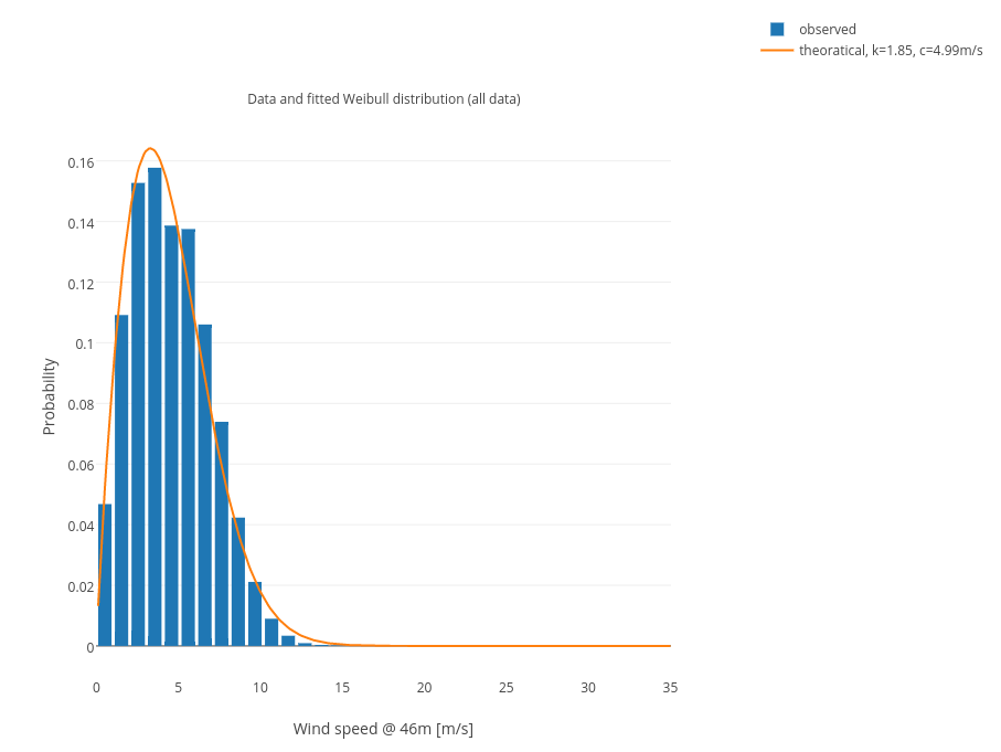
Matlab_example's interactive graph and data of "Data and fitted Weibull distribution (all data)" is a grouped bar chart, showing observed vs theoratical, k=1.85, c=4.99m/s. The x-axis shows values from 0 to 0. The y-axis shows values from 0 to 0. This visualization has the following annotation: Data and fitted Weibull distribution (all data)