Edit chart
Loading graph
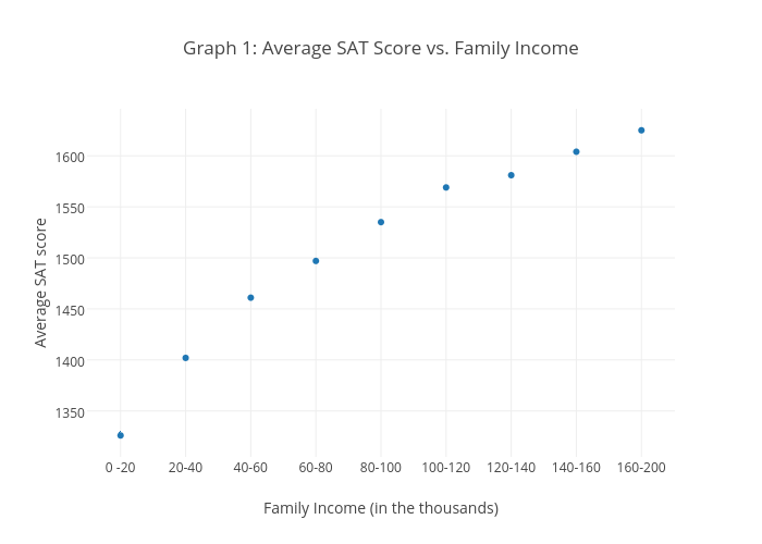
Keilanimitchell's interactive graph and data of "Graph 1: Average SAT Score vs. Family Income" is a scatter chart, showing Average SAT score; with Family Income (in the thousands) in the x-axis and Average SAT score in the y-axis.. The x-axis shows values from -0.505595303614016 to 8.505595303614015. The y-axis shows values from 1307.5903710119821 to 1643.4096289880179.