Edit chart
Loading graph
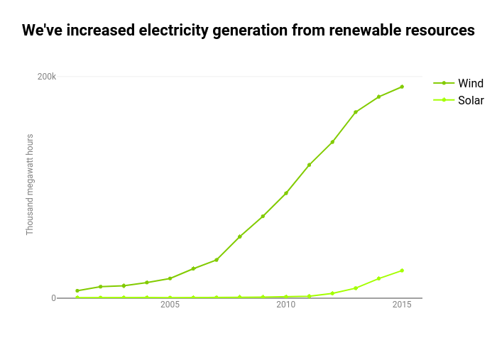
Jgray's interactive graph and data of "We've increased electricity generation from renewable resources" is a , showing Wind vs Solar; with Thousand megawatt hours in the y-axis. The x-axis shows values from 0 to 0. The y-axis shows values from 0 to 205000.