Edit chart
Loading graph
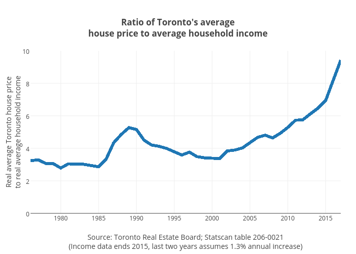
Jasonkirby's interactive graph and data of "Ratio of Toronto's averagehouse price to average household income" is a line chart, showing B; with Source: Toronto Real Estate Board; Statscan table 206-0021(Income data ends 2015, last two years assumes 1.3% annual increase) in the x-axis and Real average Toronto house priceto real average household income in the y-axis.. The x-axis shows values from 1976 to 2017. The y-axis shows values from 0 to 10.