Edit chart
Loading graph
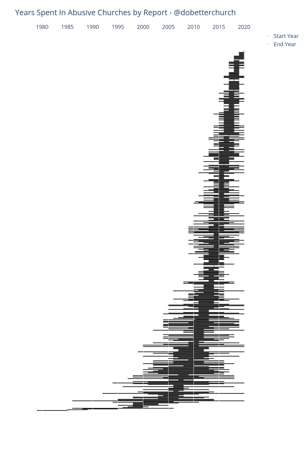
Jakemanderson's interactive graph and data of "Years Spent In Abusive Churches by Report - @dobetterchurch" is a scatter chart, showing Start Year vs End Year; with Report ID in the y-axis. The x-axis shows values from 0 to 0. The y-axis shows values from 0 to 0.