Edit chart
Loading graph
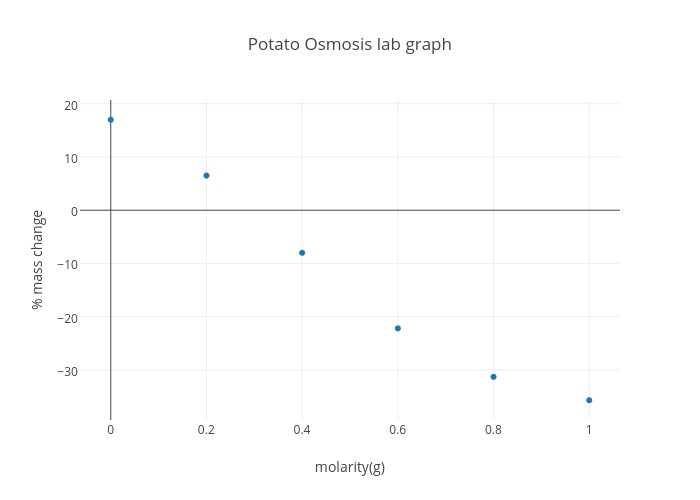
Ivana_kovac's interactive graph and data of "Potato Osmosis lab graph" is a scatter chart, showing % mass change vs % mass change - fit; with molarity(g) in the x-axis and % mass change in the y-axis.. The x-axis shows values from -0.07038279701082813 to 1.0703827970108282. The y-axis shows values from -43.434170450577135 to 20.90638141809296.