Edit chart
Loading graph
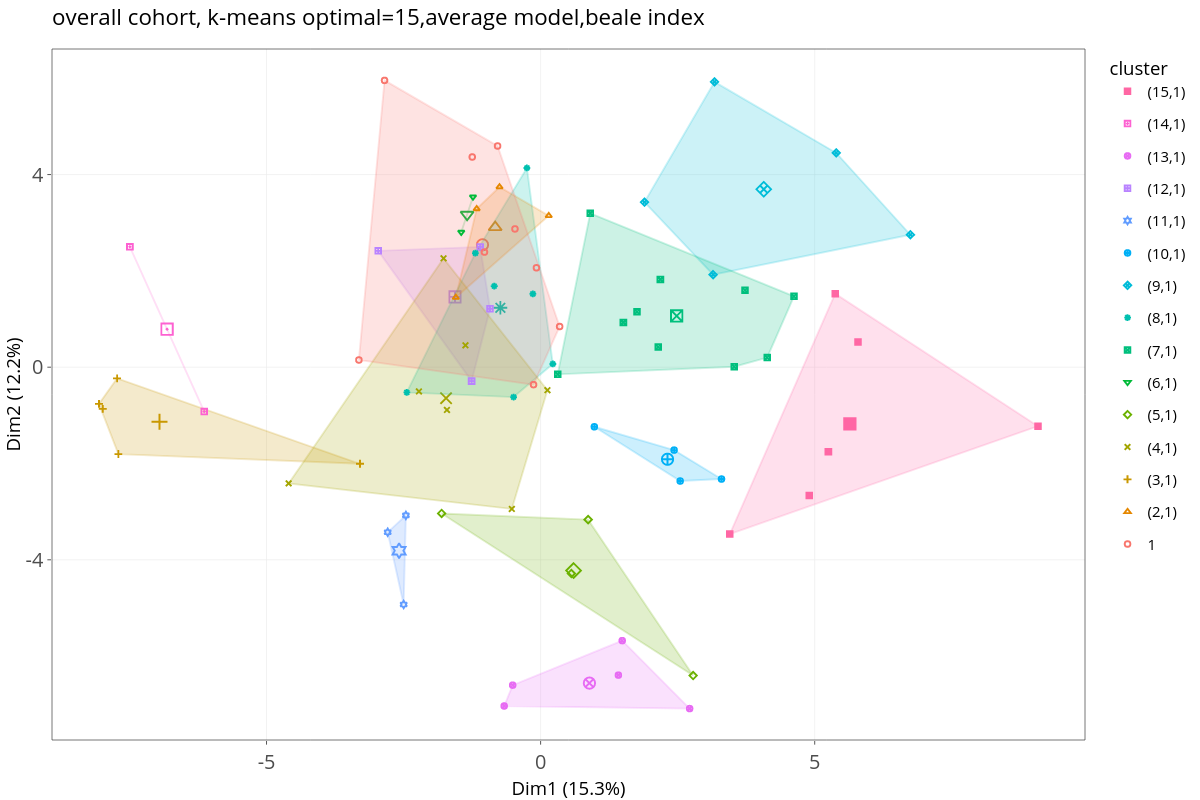
Hocamtu's interactive graph and data of "overall cohort, k-means optimal=15,average model,beale index" is a scatter chart, showing (15,1), (14,1), (13,1), (12,1), (11,1), (10,1), (9,1), (8,1), (7,1), (6,1), (5,1), (4,1), (3,1), (2,1), 1, (15,1), (14,1), (13,1), (12,1), (11,1), (10,1), (9,1), (8,1), (7,1), (6,1), (5,1), (4,1), (3,1), (2,1), 1, (15,1), (14,1), (13,1), (12,1), (11,1), (10,1), (9,1), (8,1), (7,1), (6,1), (5,1), (4,1), (3,1), (2,1), 1; with Dim1 (15.3%) in the x-axis and Dim2 (12.2%) in the y-axis.. The x-axis shows values from -8.91316773273035 to 9.930525990288906. The y-axis shows values from -7.7417849727833685 to 6.607485500051555.