Edit chart
Loading graph
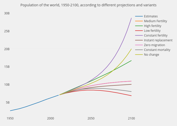
Henrylau's interactive graph and data of "Population of the world, 1950-2100, according to different projections and variants" is a scatter chart, showing Estimates, Medium Fertility, High fertility, Low fertility, Constant fertility, Instant replacement, Zero migration, Constant mortality, No change. The x-axis shows values from 1950 to 2100. The y-axis shows values from 1074631639.7222219 to 30097572225.27778.