Edit chart
Loading graph
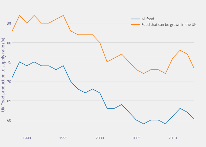
Henrylau's interactive graph and data of "All food vs Food that can be grown in the UK" is a scatter chart, showing All food vs Food that can be grown in the UK; with UK Food production to supply ratio (%) in the y-axis. The x-axis shows values from 1987.9386355991794 to 2012.9386355991796. The y-axis shows values from 56.06682728255894 to 87.17793839367005.