Edit chart
Loading graph
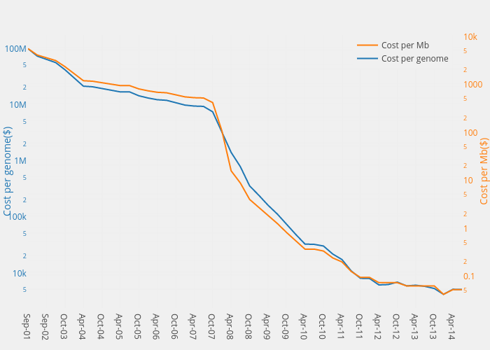
Henrylau's interactive graph and data of "Cost per Mb vs Cost per genome" is a scatter chart, showing Cost per Mb vs Cost per genome; with Cost per genome($) in the y-axis. The x-axis shows values from 0 to 47. The y-axis shows values from 3.3598167756662924 to 8.222035519524216.