Edit chart
Loading graph
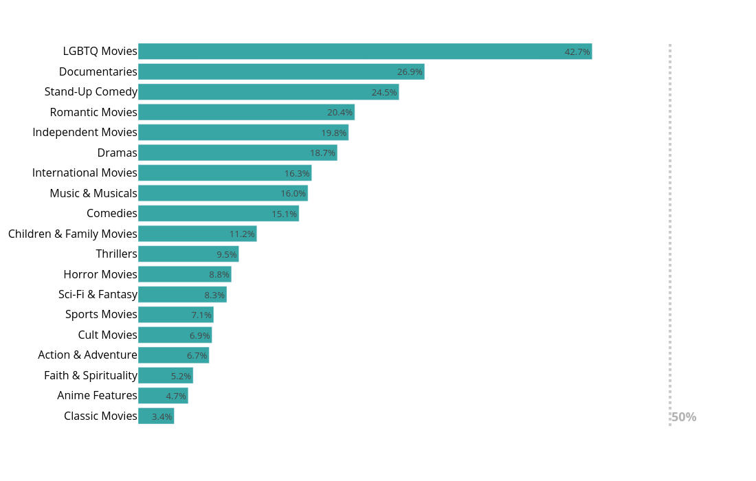
Fcollu's interactive graph and data of "{'x': 0.5, 'y': 0.9, 'xanchor': 'center', 'yanchor': 'top'}" is a bar chart, showing FemaleRatio; with value in the x-axis and {} in the y-axis.. The x-axis shows values from 0 to 0. The y-axis shows values from 0 to 0. This visualization has the following annotation: 50%