Edit chart
Loading graph
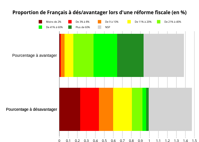
Fabre.adri1's interactive graph and data of "Proportion de Français à dés/avantager lors d'une réforme fiscale (en %)" is a stacked bar chart, showing Moins de 2%, De 3% à 8%, De 9 à 10%, De 11% à 20%, De 21% à 40%, De 41% à 60%, Plus de 60%, NSP. The x-axis shows values from 0 to 0. The y-axis shows values from 0 to 0. This visualization has the following annotations: Pourcentage à désavantager; Pourcentage à avantager; Pourcentage à désavantager