Edit chart
Loading graph
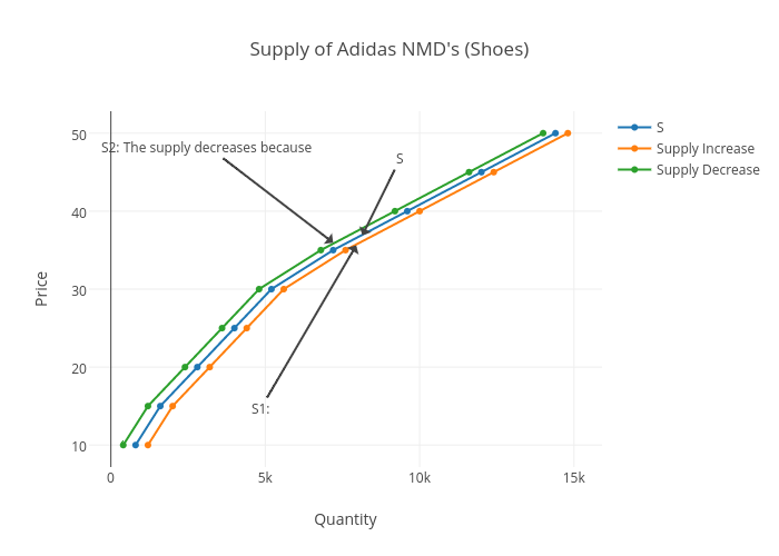
D.yang.17's interactive graph and data of "Supply of Adidas NMD's (Shoes)" is a scatter chart, showing S, Supply Increase, Supply Decrease; with Quantity in the x-axis and Price in the y-axis.. The x-axis shows values from -482.1355236139631 to 15682.135523613963. The y-axis shows values from 7.417962003454232 to 52.58203799654577. This visualization has the following annotations: S; S1:; S2: The supply decreases because