Edit chart
Loading graph
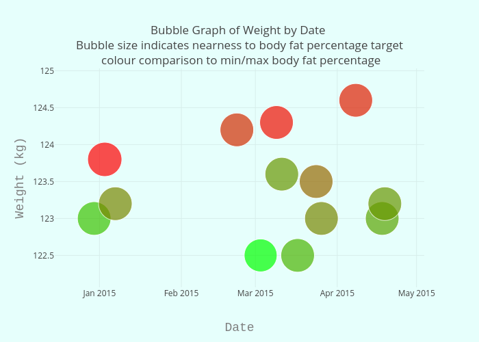
Bigmansam45's interactive graph and data of "Bubble Graph of Weight by Date Bubble size indicates nearness to body fat percentage target colour comparison to min/max body fat percentage" is a scatter chart; with Date in the x-axis and Weight (kg) in the y-axis.. The x-axis shows values from 0 to 0. The y-axis shows values from 0 to 0.