Edit chart
Loading graph
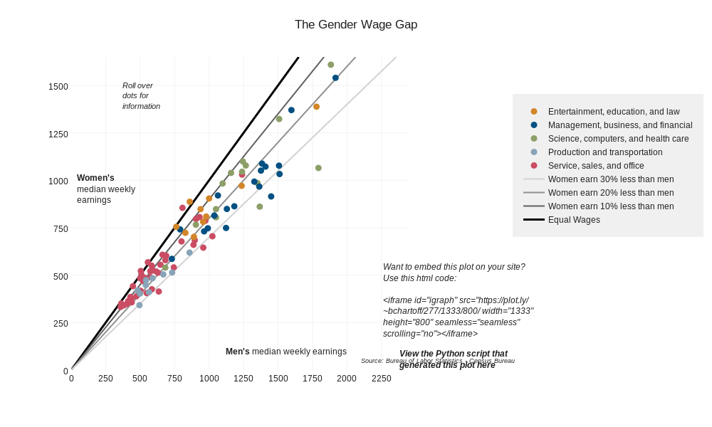
Bchartoff's interactive graph and data of "The Gender Wage Gap " is a scatter chart, showing Equal Wages, Women earn 10% less than men, Women earn 20% less than men, Women earn 30% less than men, Service, sales, and office, Production and transportation, Science, computers, and health care, Management, business, and financial, Entertainment, education, and law. The x-axis shows values from 0 to 2437. The y-axis shows values from 0 to 1650. This visualization has the following annotations: Source: Bureau of Labor Statistics - Census Bureau; Men's median weekly earnings; Women'smedian weeklyearnings; Roll overdots forinformation; View the Python script thatgenerated this plot here; Want to embed this plot on your site?Use this html code: height="800" seamless="seamless" scrolling="no">