Edit chart
Loading graph
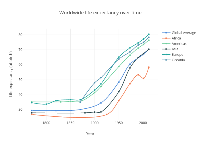
Amatelin's interactive graph and data of "Worldwide life expectancy over time" is a line chart, showing Global Average, Africa, Americas, Asia, Europe, Oceania; with Year in the x-axis and Life expectancy (at birth) in the y-axis.. The x-axis shows values from 0 to 0. The y-axis shows values from 0 to 0.