Edit chart
Loading graph
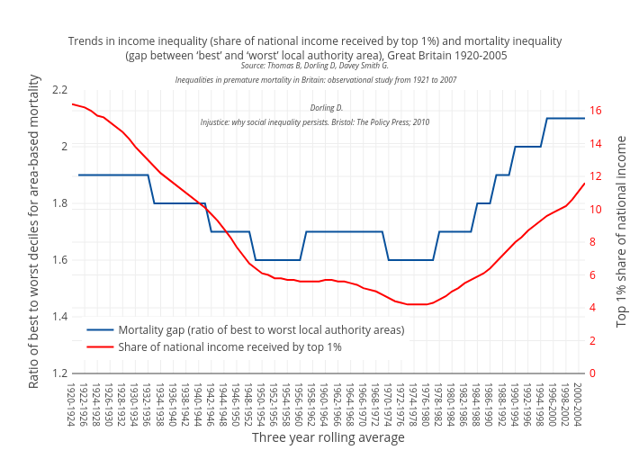
Scotpho's interactive graph and data of "Trends in income inequality (share of national income received by top 1%) and mortality inequality (gap between ‘best’ and ‘worst’ local authority area), Great Britain 1920-2005Source: Thomas B, Dorling D, Davey Smith G. Inequalities in premature mortality in Britain: observational study from 1921 to 2007 Dorling D. Injustice: why social inequality persists. Bristol: The Policy Press; 2010 " is a line chart, showing Mortality gap (ratio of best to worst local authority areas) vs Share of national income received by top 1%; with Three year rolling average in the x-axis and Ratio of best to worst deciles for area-based mortality in the y-axis.. The x-axis shows values from 0 to 0. The y-axis shows values from 1.2 to 2.2.