Edit chart
Loading graph
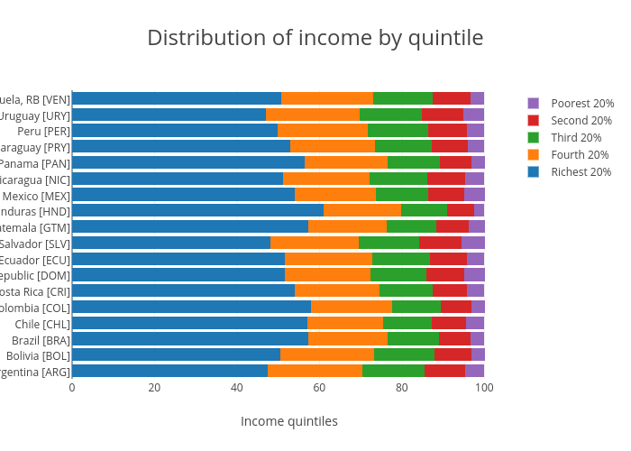
Mcmv's interactive graph and data of "Distribution of income by quintile" is a stacked bar chart, showing Richest 20%, Fourth 20%, Third 20%, Second 20%, Poorest 20%; with Income quintiles in the x-axis. The x-axis shows values from 0 to 105.36842105263159. The y-axis shows values from -0.5 to 17.5.