Edit chart
Loading graph
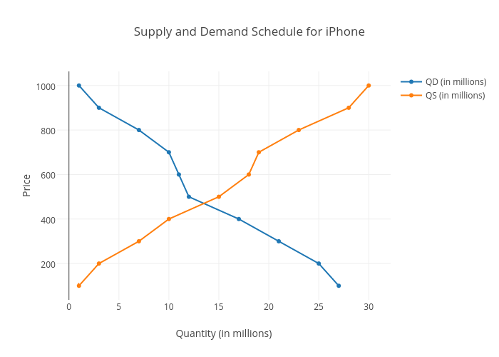
10127's interactive graph and data of "Supply and Demand Schedule for iPhone" is a scatter chart, showing QD (in millions) vs QS (in millions); with Quantity (in millions) in the x-axis and Price in the y-axis.. The x-axis shows values from -1.0511939218523882 to 32.05119392185239. The y-axis shows values from 31.53618906942394 to 1068.463810930576.